@野鹿志: In this tutorial, we use AI to create a sketch cartoon style poster. The entire tutorial is relatively simple and of medium difficulty. Students with basic knowledge can complete it quickly, but some details will require a little patience and time. Students can follow the tutorial and use it in later design or wherever posters are needed. Let’s learn how to operate it together.
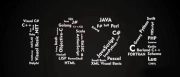
Rendering:

www.16xx8.com
Operation steps:
Open Ai and create a new drawing board of any size:

Make a few color blocks first so that you can absorb colors later:

Draw a rectangle the same as the artboard, and use Ctrl+2 to lock it as the background color:

First make a reference line and draw a 200*200 square with any color:

Execution effect – 3D – Extrusion and bevel, the position is selected as equiangular – left or right, the extrusion thickness is also 200, and the surface is selected as wireframe:

In order to see it more clearly, you can expand the wireframe cube and make the stroke thicker:

There is no need to say much about the move and copy step. The final Ctrl+2 lock is probably like this:

Select the appropriate font and font size, and outline it with Ctrl+Shift+O:

Change the color of the text, and then roughly position it:

After selecting all the text, execute Effects – 3D – Extrusion and Bevel first. The thickness of the extrusion is still 200, and the position can be selected as Isometric – left or right:

Then change the position in the 3D properties of some text. Anyway, it is not equiangular – left or right. Pay attention to the order of the layers:

�The above is processed individually with reference to the position of each text, ahhh, it is very tiring.
Open the 3D properties of the letter C, change the protrusion thickness to 0, and select No Shading on the surface:

After expanding it, give it a stroke and pay attention to the stroke parameters. We will try to ensure that the stroke parameters are consistent later:

Copy it against the reference line and place it in a suitable position, then mix it. The number of mixing steps is up to you:

The letter U also has the protruding thickness changed to 0, and the surface is selected to have no shading:

Use the pen tool to complete shapes:

Combine shapes in Pathfinder:

Use the white tool to select the endpoint of the corner and change it to an arc:

Stroke again, make a copy, and shrink it slightly:

Then mix:

Next is the letter R. Use the rectangle tool to draw a 10*10 square. The stroke parameters are the same as before, and the endpoints are changed to flat ends.
Don’t ask me why, I can only say that after trying it, the round head seems to cause errors when using the 3D mapping function:

Needless to say this step, move and copy. After many attempts, it would be better to make a rectangular texture:

Drag it into the symbol panel and create a new symbol:

The following is the texture. Needless to say this step, pay attention to adjusting the position of the texture to make the connection more harmonious:

The next step is to change the fill color of the letter R after expansion and add a suitable stroke. In order to make the overall assembly more accurate, I scaled the R by 99% and then assembled it:

Next, we need to change the shape of the letter E, stretching the letter as shown in the picture:

Execution Effect-Deformation-Arch:

Draw another ellipse to join together:

Select the ellipse and scale it by 50%. Remember to check the proportional scaling stroke and effect:

Then blend the two ellipses:

Scale the letter E in the same way:

Then mix the letter E:

Draw another ellipse at the top:

Then scale and copy an ellipse:

Pathfinder minus the top-level object:

Draw a rectangle half way through the hollow part in the middle:

Execute Effect-3D-Rotate and paste the required parts on the picture:

Then expand the object and delete the redundant parts:

The other two letters I and P use the same method as before, one texture and one blend. I won’t go into details here. After finishing, it will look like this, and finally half of it is done:

Next, let’s do the second half. Let’s make the letter S first. Draw a pattern like this. No need to say more here:

New as symbol:

Select the surface as a plastic effect shading, and the shading color is purple, which will give the font a slight color tendency:

Here is a description of the sticker. Sometimes you will find that the pattern cannot be pasted. There are two solutions:
1. Rasterize the pattern before creating a new symbol, but if the pattern is enlarged, it will have jagged edges.
2. Check the box for the texture to have light and shade, but this will be a bit laggy.

After the texture is completed, expand it, change the color and add a stroke. There is no need to go into details on this step, just be more detailed:

The same method is used for other letters, so I won’t go into details here:

Make another letter E shape and change the 3D protrusion thickness to 0:

After expansion, lengthen the stroke appropriately:

Use the pen tool to fill in the shape while looking at the guide lines:

Pathfinder merge:

Use the white tool to change the right angles to rounded corners:

Change the color, and then use the mirror tool to make a horizontal and symmetrical copy:

Manually put the two letters into a square-like shape, and use the white tool to adjust the anchor point alignment:

Then mix:

Then shape the letter T and draw a quarter circle and cuboid:

Execute Effect-3D-Protrusion and Bevel respectively, the parameters can be adjusted as you like:

Then paste the part of the sticker:

After expansion, change the color and stroke, just like before, so I won’t repeat it:

It’s almost over, it’s almost over, victory is ahead:

Finally, you need to add some patterns and embellishments in appropriate places. The method is not the only one. You can just add it bit by bit. I still use textures, taking the letter E in the middle as an example, and expand it first:

After ungrouping, select the top letters, go to Effects-3D-Extrusion and Bevel, select the position as front, and other parameters are the same as before:

Then paste the picture:

It’s up to you to decorate the other parts. You can also just draw circles on it. After you finish it, it will look like this. I’m exhausted:

Finally, code, type, and prototype, let’s see the effect:
www.16xx8.com
Ahhhh, this article was originally written on Sunday, and it was already past midnight when I finished it.
That’s probably it. For the polka dot pattern, I tried using colored halftones, but it didn’t seem to work very well.
If you use C4D to do it, I feel that it may be more convenient just to create 3D, and it will not be troublesome to adjust the details.
For the sake of convenienceFor everyone’s convenience, I recorded a video. The order of making is different, but the method is the same.
This article was published by “Yelu Zhi”
Please contact the author “马鹿野郎” before reprinting
Private transfers will be investigated
Learning is a very boring thing, but fortunately, this is what we love, and we hope that students will find the joy of learning while using it.
@野鹿志: In this tutorial, we use AI to create a sketch cartoon style poster. The entire tutorial is relatively simple and of medium difficulty. Students with basic knowledge can complete it quickly, but some details will require a little patience and time. Students can follow the tutorial and use it in later design or wherever posters are needed. Let’s learn how to operate it together.
Rendering:
www.16xx8.com
Operation steps:
Open Ai and create a new drawing board of any size:
Make a few color blocks first so that you can absorb colors later:
Draw a rectangle the same as the artboard, and use Ctrl+2 to lock it as the background color:
First make a reference line and draw a 200*200 square with any color:
Execution effect – 3D – Extrusion and bevel, the position is selected as equiangular – left or right, the extrusion thickness is also 200, and the surface is selected as wireframe:
In order to see it more clearly, you can expand the wireframe cube and make the stroke thicker:
There is no need to say much about the move and copy step. The final Ctrl+2 lock is probably like this:
Select the appropriate font and font size, and outline it with Ctrl+Shift+O:
Change the color of the text, and then roughly position it:
After selecting all the text, execute Effects – 3D – Extrusion and Bevel first. The thickness of the extrusion is still 200, and the position can be selected as Isometric – left or right:
Then change the position in the 3D properties of some text. Anyway, it is not equiangular – left or right. Pay attention to the order of the layers:
The following is to process each text individually with reference to the position. Ahhh, it is very tiring.
Open the 3D properties of the letter C, change the protrusion thickness to 0, and select No Shading on the surface:
After expanding it, give it a stroke and pay attention to the stroke parameters. We will try to ensure that the stroke parameters are consistent later:
Copy it against the reference line and place it in a suitable position, then mix it. The number of mixing steps is up to you:
The letter U also has the protruding thickness changed to 0, and the surface is selected to have no shading:
Use the pen tool to complete shapes:
Combine shapes in Pathfinder:
Use the white tool to select the endpoint of the corner and change it to an arc:
Stroke again, make a copy, and shrink it slightly:
Then mix:
Next is the letter R. Use the rectangle tool to draw a 10*10 square. The stroke parameters are the same as before, and the endpoints are changed to flat ends.
Don’t ask me why, I can only say that after trying it, the round head seems to cause errors when using the 3D mapping function:
Needless to say this step, move and copy. After many attempts, it would be better to make a rectangular texture:
Drag it into the symbol panel and create a new symbol:
The following is the texture. Needless to say this step, pay attention to adjusting the position of the texture to make the connection more harmonious:
The next step is to change the fill color of the letter R after expansion and add a suitable stroke. In order to make the overall assembly more accurate, I scaled the R by 99% and then assembled it:
Next, we need to change the shape of the letter E, stretching the letter as shown in the picture:
Execution Effect-Deformation-Arch:
Draw another ellipse to join together:
Select the ellipse and scale it by 50%. Remember to check the proportional scaling stroke and effect:
Then blend the two ellipses:
Scale the letter E in the same way:
Then mix the letter E:
Draw another ellipse at the top:
Then scale and copy an ellipse:
Pathfinder minus the top-level object:
Draw a rectangle half way through the hollow part in the middle:
Execute Effect-3D-Rotate and paste the required parts on the picture:
Then expand the object and delete the redundant parts:
The other two letters I and P use the same method as before, one texture and one blend. I won’t go into details here. After finishing, it will look like this, and finally half of it is done:
Next, let’s do the second half. Let’s make the letter S first. Draw a pattern like this. No need to say more here:
New as symbol:
Select the surface as a plastic effect shading, and the shading color is purple, which will give the font a slight color tendency:
Here is a description of the sticker. Sometimes you will find that the pattern cannot be pasted. There are two solutions:
1. Rasterize the pattern before creating a new symbol, but if the pattern is enlarged, it will have jagged edges.
2. Check the box for the texture to have light and shade, but this will be a bit laggy.
After the texture is completed, expand it, change the color and add a stroke. There is no need to go into details on this step, just be more detailed:
The same method is used for other letters, so I won’t go into details here:
Make another letter E shape and change the 3D protrusion thickness to 0:
After expansion, lengthen the stroke appropriately:
Use the pen tool to fill in the shape while looking at the guide lines:
Pathfinder merge:
Use the white tool to change the right angles to rounded corners:
Change the color, and then use the mirror tool to make a horizontal and symmetrical copy:
Manually put the two letters into a square-like shape, and use the white tool to adjust the anchor point alignment:
Then mix:
Then shape the letter T and draw a quarter circle and cuboid:
Execute Effect-3D-Protrusion and Bevel respectively, the parameters can be adjusted as you like:
Then paste the part of the sticker:
After expansion, change the color and stroke, just like before, so I won’t repeat it:
It’s almost over, it’s almost over, victory is ahead:
Finally, you need to add some patterns and embellishments in appropriate places. The method is not the only one. You can just add it bit by bit. I still use textures, taking the letter E in the middle as an example, and expand it first:
After ungrouping, select the top letters, go to Effects-3D-Extrusion and Bevel, select the position as front, and other parameters are the same as before:
Then paste the picture:
It’s up to you to decorate the other parts. You can also just draw circles on it. After you finish it, it will look like this. I’m exhausted:
Finally, code, type, and prototype, let’s see the effect:
www.16xx8.com
Ahhhh, this article was originally written on Sunday, and it was already past midnight when I finished it.
That’s probably it. For the polka dot pattern, I tried using colored halftones, but it didn’t seem to work very well.
If you use C4D to do it, I feel that it may be more convenient just to create 3D, and it will not be troublesome to adjust the details.
In order to make it easier for everyone to operate, I still recorded a video. The order of making is different, but the method is the same.
This article was published by “Yelu Zhi”
Please contact the author “马鹿野郎” before reprinting
Private transfers will be investigated
Learning is a very boring thing, but fortunately, this is what we love, and we hope that students will find the joy of learning while using it.
 微信扫一扫打赏
 支付宝扫一扫打赏